Hit or miss? Here is the League logo for the 2026–27 season
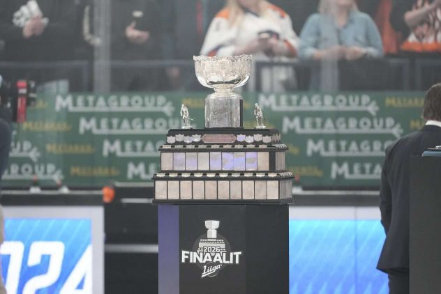
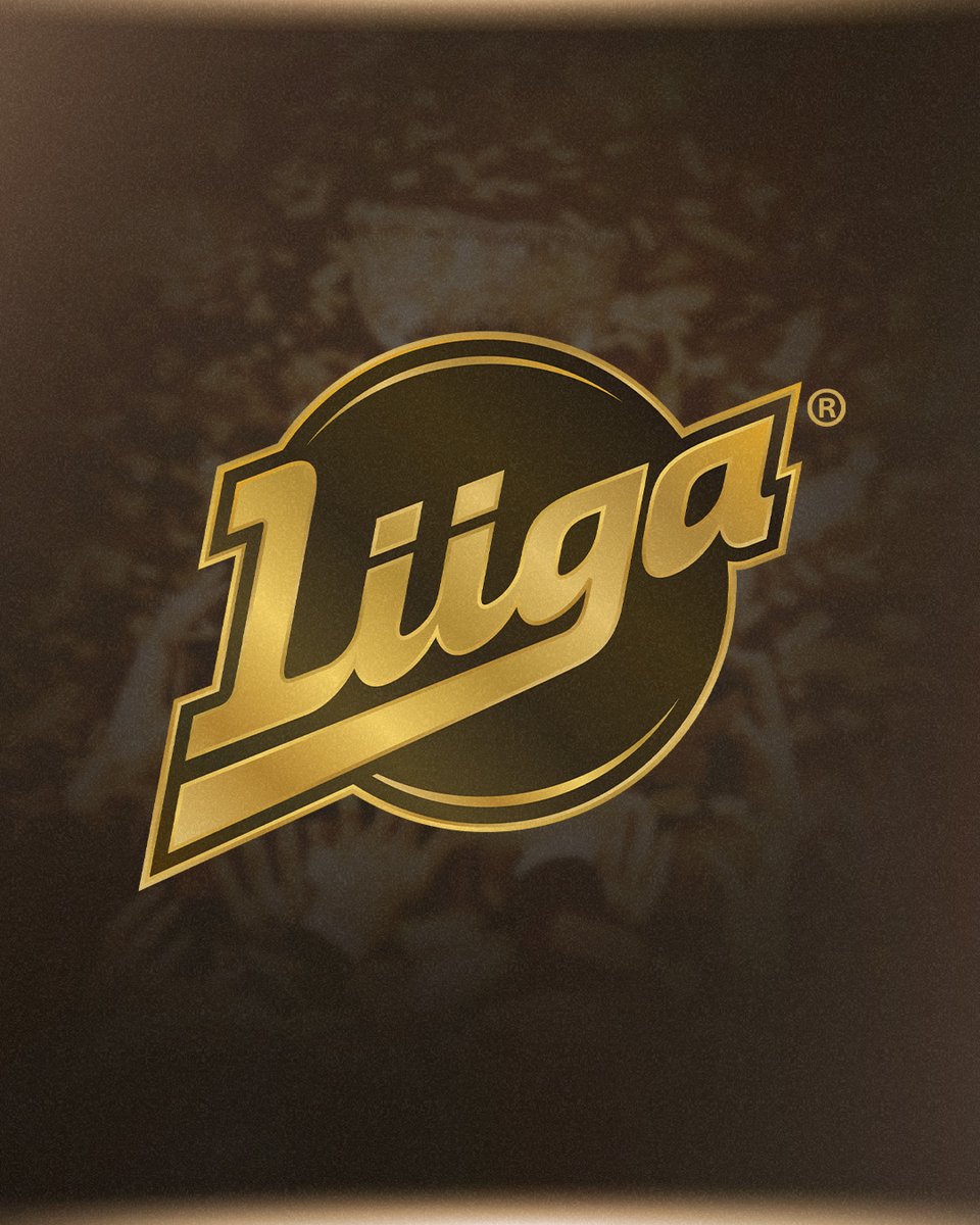
The league’s logo has been updated for the 2026–27 season.
The league has released a special logo that is very similar to the previous one, but in golden color.
The redesign of the logo was handled by designer Antti Tuomisto.
– Brand matters are a big passion for me, so I was excited to be involved.
– It quickly felt like there was no need to change the logo itself or create a completely new one. That could get confusing. This current logo has been in use for over ten years, and it has become really recognizable, Tuomisto says on the league’s website.
According to Tuomisto, the main goal of the project was to maintain the league’s recognizability. He did not want the logo to be too heavy or overloaded with symbols.
– Some criticize the current logo, but I think it has been good and functional. It is simple: there is a puck at the bottom, the shape is clear, and there are not too many extra elements in the logo, Tuomisto comments.
The upcoming league season 2026–27 is a transitional season that will be played with 17 teams. After that, it will move to a new (14+10) league format.
The league’s new logo


 Lue lisää: liiga.fi/fi/uutiset/lii…
#Liiga
Read more







- Rasmus Ristolainen’s torment continues in the NHL – yet another terrible setback
- TPS star received a massive ban for biting – TS: Denies the accusations
- A terrible setback for SHL’s Finnish star in Sweden – a long sick leave is looming
- The league’s star defender received a suspension – the disciplinary committee dismissed the explanation
- IL: Jukka Jalonen’s new job was revealed
- IS: HIFK has signed the head coach of a competitor – negotiations are already advanced!
- Urheilucast: Jori Lehterä opened the door for the league’s championship favorite – this will decide everything!
- Lehtitieto: The Liiga club loses its point machine – a new club is already known!
- The Young Lions team announced – now the final performances are given before the World Championship selections
- Jussi Tapola steps aside from the Lions – an experienced name as a replacement